ZOE Covid Study - confidence intervals
ZOE confidence intervals are not always comparable between graphs. Even in some individual graphs, the interval may be misleading. For example the interval may appear narrow, where it should have grown wider.
ZOE have not mentioned these limitations. They no longer provide definitions, which would help an independent expert notice these limitations. ZOE transparency information may help with reverse-engineering some limitations.
I started writing this post as a reminder to myself, to avoid unsafe assumptions. Perhaps some of the details will help further understanding. Sadly, it seems to be quite long. I have split out ZOE method v3 as a more self-contained introduction. This was the first case where I had a concern.
I am not an expert.
1. Case study: ZOE method v3
1.1. Background information
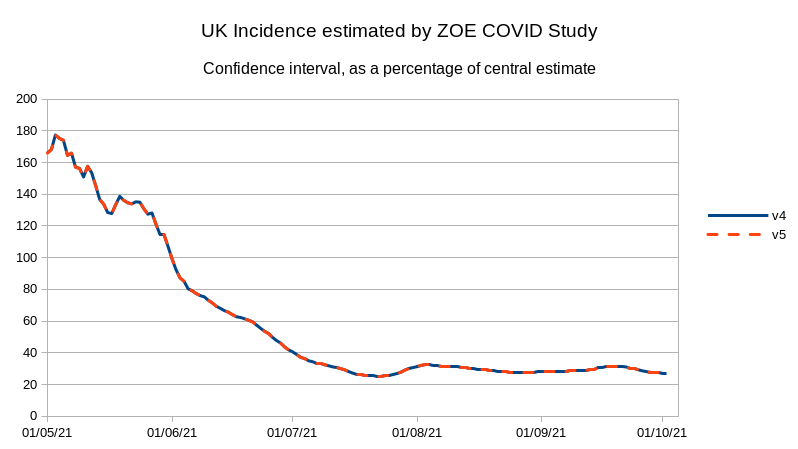
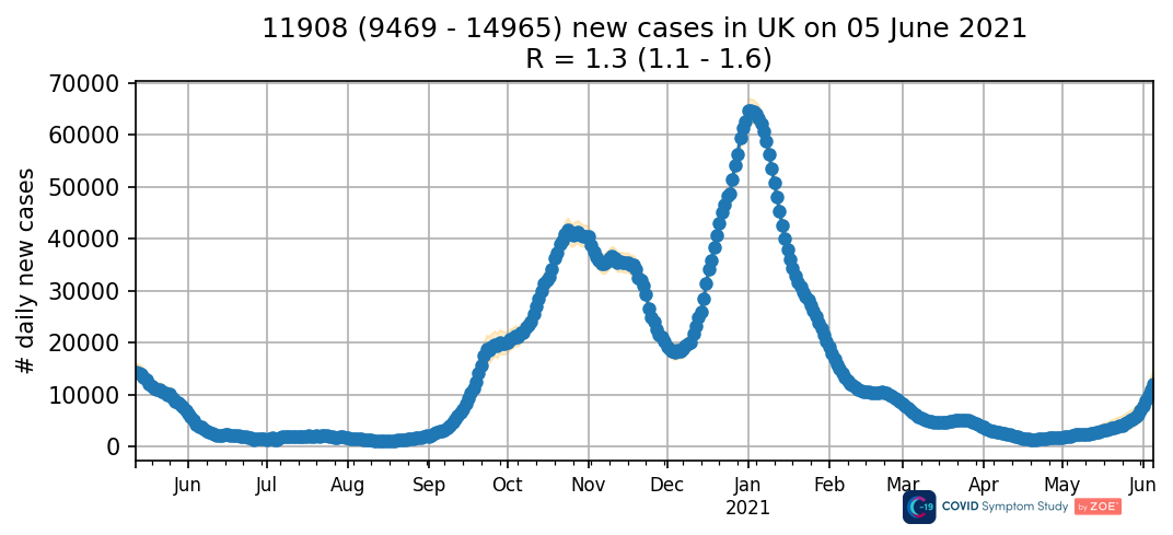
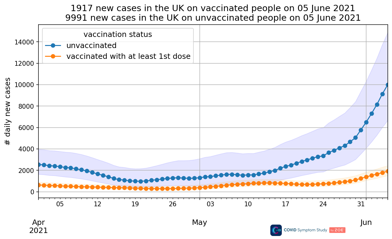
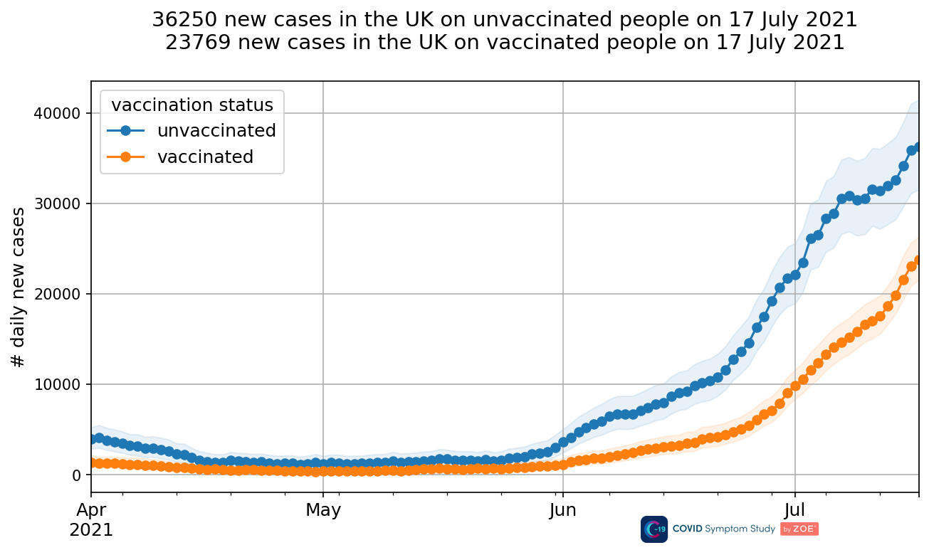
The ZOE method “v3”, is illustrated by the graph of new cases by vaccination status. New cases were estimated separately in the unvaccinated and vaccinated, then added together. When the unvaccinated estimate became unreliable, so did the overall trend.
Changelog
[…]
2021-07-16: Removed incidence graph by vaccination status from the report as there are very few unvaccinated users in the infection survey, the Confidence Intervals are very wide and the trend for unvaccinated people is no longer representative.
This limitation was not immediately publicised. ZOE publicity on the 14th and 15th said “we can definitely now say that these new cases have plateaued”, and talked about “the rate of decline” over time. But the trend was changed a week later, in method “v4”. For links to each method change, see ZOE Covid Study - part 2 - the method.
Reading the “v4” announcement, we can understand the concern that the trend was “no longer representative”. This is a separate concern from the confidence interval. By adding more tests (LFTs), ZOE was able to adjust their sample by age group. This resulted in a different trend.
Separately, if there were more than enough extra tests to make up for the new adjustment, the random sampling error would also be lower. The random sampling error is what the confidence intervals are supposed to estimate.
1.2. Problem with confidence intervals
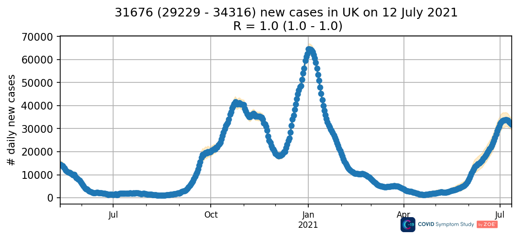
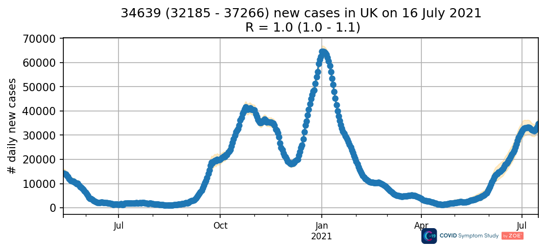
The confidence intervals in the graphs linked above are not consistent. The interval for the unvaccinated was about 12,500 wide, but the interval for the UK totals was only about 4,500 wide.
They also do not change consistently over time. Look back at when the graph by vaccination status was first shown in the daily report. The interval in the unvaccinated was about 8,000 wide, while the interval for the UK total was about 5,500 wide. The interval for the unvaccinated increased by 50%, but the interval for the UK total only increased by 20%.
I am not entirely sure how to combine confidence intervals from the two sub-groups. However, ZOE’s method “v3” produced misleading confidence intervals on every graph except for the breakdown by vaccination. I think this should have been highlighted.
It would also help if ZOE defined their method. This would help independent commenters understand ZOE estimates. In this particular case, we can work out the method ourselves.
The “v3” interval does not widen when the unvaccinated sample shrinks. This is because the interval does not look at the size of the unvaccinated sub-sample. It only looks at the number of tests and positive tests in the overall sample. It is the same method as used in “v2”, except scaled to the “v3” estimate instead of the “v2” one.
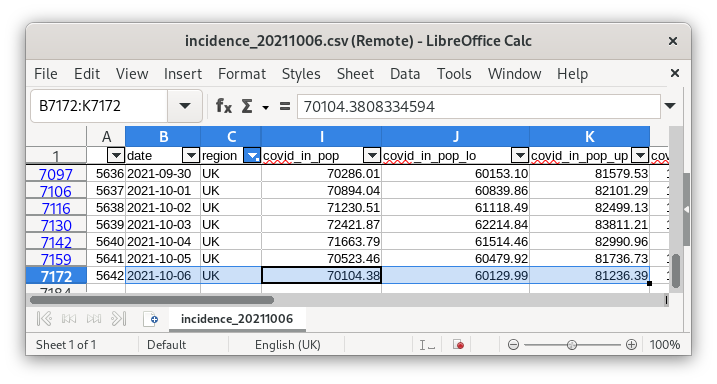
We can graph the confidence intervals as a percentage of the central estimate. The line produced by the historical series of intervals for method v3 looks exactly the same as the line for v2. I have plotted v3 as a dashed line, so we can see the v2 line behind it.
For method “v2”, the confidence interval was estimated from the number of tests and the number of positive tests. See full timeline below.
2. Timeline
2020-10-27: ZOE method v1 - the ZOE paper - is posted in its initial form as a preprint on medrxiv.org.
Method v1 uses 95% confidence intervals. They are calculated from the number of tests and the number of positive tests, using something called the Wilson score.
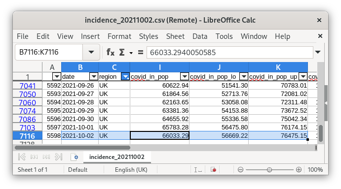
I found a helpful python function to calculate the Wilson score interval. ZOE test data for their latest 14-day interval is available from incidence table.csv. Looking at historical downloads, I can reproduce both the central estimate and the confidence intervals.
…
2021-05-12: ZOE method v3. Incidence is now estimated separately in vaccinated and unvaccinated people. These are added together to give total UK incidence.
2021-05-27: The label “95% confidence interval” was removed from all graphs. The official releases no longer say anything about how the confidence intervals work.
Up to the current day, internal website files still label the incidence intervals as 95% upper and lower limits. These include “incidence table.csv”. Although, if effectively no-one looks at this, I do not expect it to be kept up to date.
On balance, I think the confidence intervals for UK and regional incidence graphs are probably always calculated using a 95% confidence level.
2021-06-08: Confidence intervals are now calculated slightly differently, compared to the original Wilson score. In a couple of edge cases, there are noticable differences. For my purposes, the two methods appear equivalent.
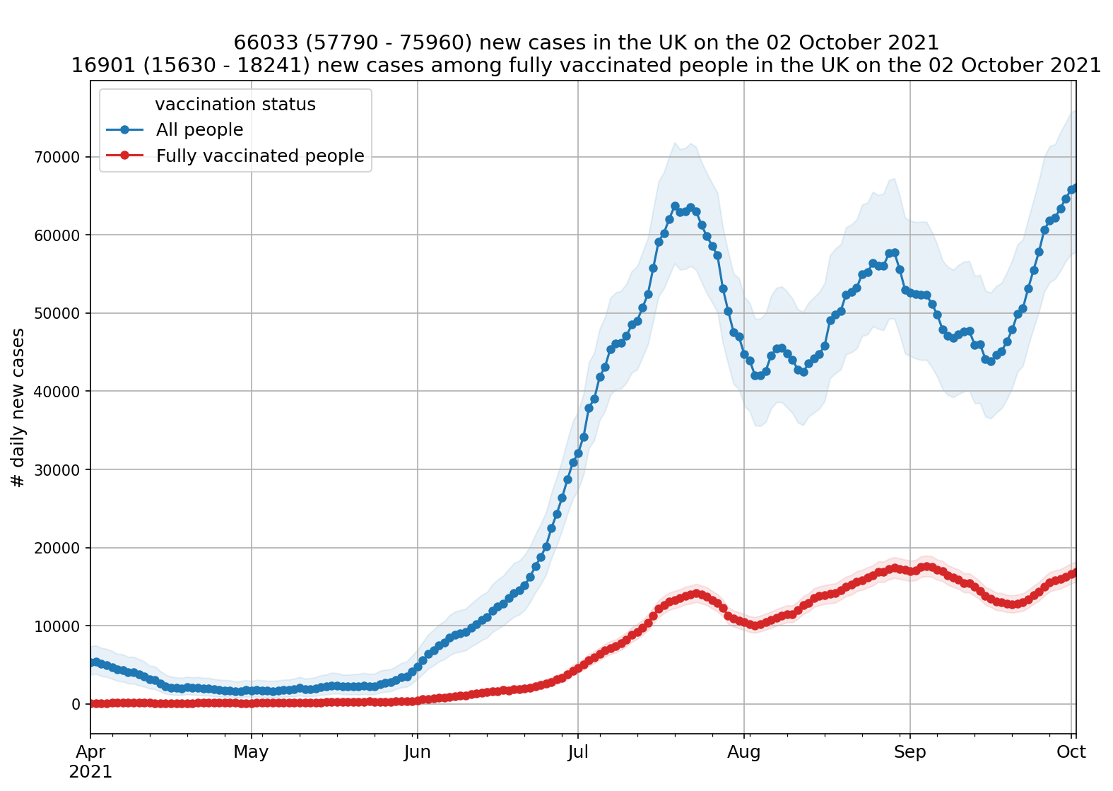
2021-06-09: A graph is added to show incidence by vaccination status. The absolute difference between upper and lower confidence intervals is higher for unvaccinated cases (8,000), than it is for the graph showing total UK cases (5,500).
I think there is a problem here, in the interval on the graph of total UK cases. I think it is calculated based on the number of tests overall, instead of looking at the two subsamples separately. I made a graph of the interval as a percentage of the central estimate, and it appears to be identical between v2 and v3.
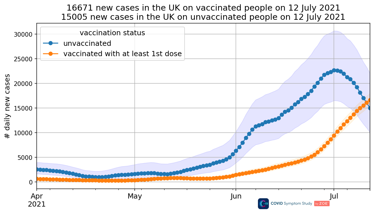
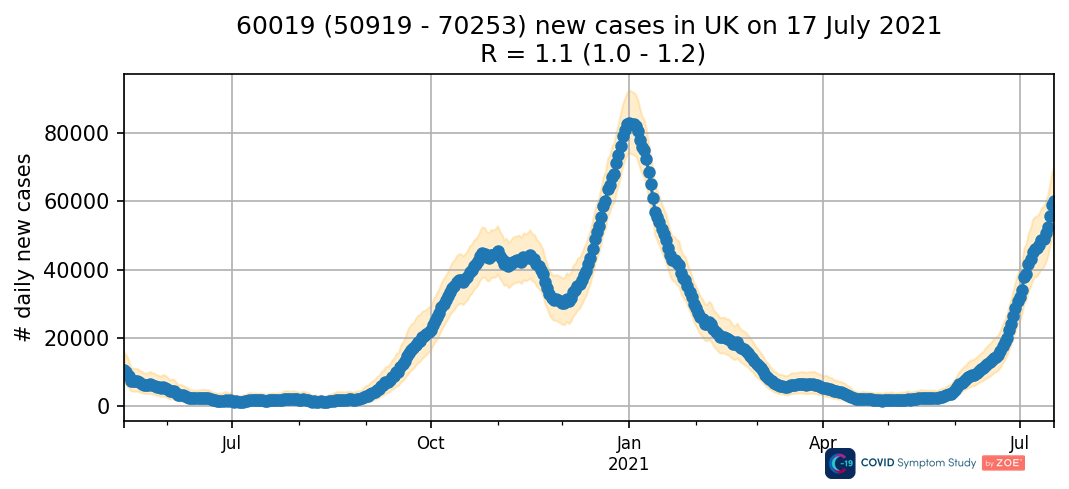
2021-07-17: The changelog says “Removed incidence graph by vaccination status from the report as there are very few unvaccinated users in the infection survey, the Confidence Intervals are very wide and the trend for unvaccinated people is no longer representative.” The inconsistency in confidence intervals was also quite large at this point (12,500 v.s. 4,500).
2021-07-21: ZOE method v4. The confidence intervals no longer match the Wilson score interval calculated from the overall number of tests and positive tests. So that’s good.
The daily report starts showing incidence by vaccination status again. This time, the intervals for total UK incidence appear wider than the intervals for unvaccinated and vaccinated incidence put together. This is inconsistent again, just the other way round.
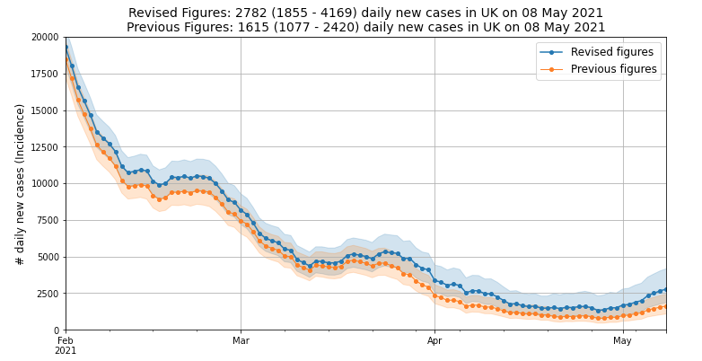
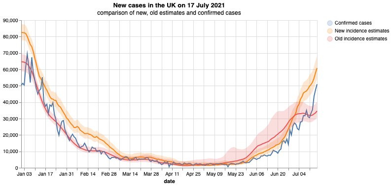
The announcement of method v4 includes a graph comparing old and new estimates. The intervals for the new estimate on this graph, are different from the UK total graph in the report. They might be consistent with the new graph by vaccination status.
Similarly, the intervals for the old estimate on the comparison graph are different from the old UK total graphs. They are closer to being consistent with the older “by vaccination” graphs, though still visibly inconsistent. It would require some historical revisions.
The new graphs by vaccination status have narrower intervals than the older graphs by vaccination status. This could be result of method v4 increasing the number of tests several-fold. (In part, because it went back to including LFT’s).
The incidence estimate for England is now calculated by adding up the incidence estimates for each English region. That part is good. Sadly, the confidence limits for England are also now calculated by adding up the confidence limits for each English region. Again, I’m not entirely sure how I would do this myself, but this isn’t how confidence limits work. This should have been declared. The confidence intervals for England may be more than twice as wide as they should be!
The UK confidence limits are also much wider than they should be, because they are now calculated by adding up the confidence limits for the UK nations, which include England. To be clear, this issue has still not been resolved, so it affects the latest method (v5) as well as method v4.
2021-08-26: The graph by vaccination status is changed, to show incidence among the fully vaccinated v.s. total incidence. The current confidence intervals are similar to the dedicated graph of total UK incidence, but not identical.
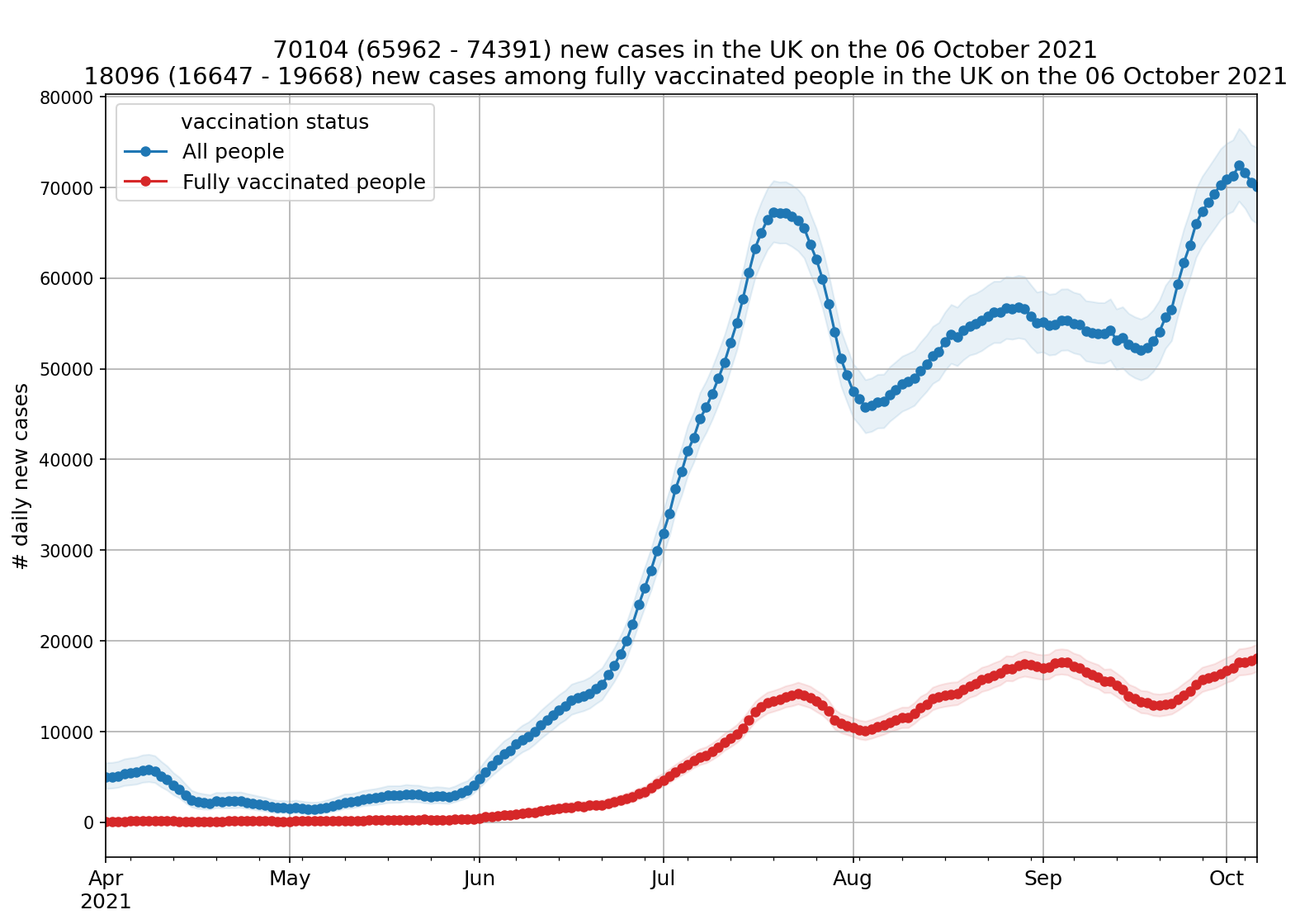
2021-10-06: Just before method v5. The confidence intervals remain similar but not identical. Note the graph of total UK incidence was not included in the daily report at this time, although it was viewable through the app.
2021-10-07: ZOE method v5. The purpose of this change is to narrow the confidence interval, making the estimate more sustainable “with unvaccinated users disappearing from our study”. This is illustrated with a graph. The announcement is unclear how this result is achieved.
2021-10-10: Method v5 is stabilized by now, after a little back-and-forth. There is still a graph with incidence among the fully vaccinated, v.s. total incidence. On this graph, the confidence intervals for total incidence are less than half as wide as those on the dedicated graph of total UK incidence.
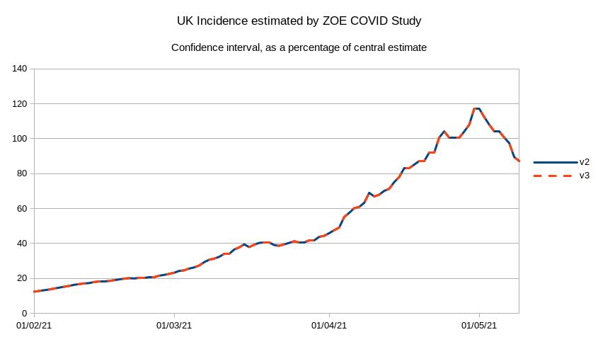
So although the point of method v5 is narrower confidence intervals, this can only be seen on the graph of incidence by vaccination status. The graphs for the UK, England etc. don’t take advantage of it. I was suprised to find the same pattern as in the change to v3. When ZOE switched to v5, the relative size of the confidence intervals shown remained identical to v4. I plotted a graph below to show this again.
2021-12-07: I asked ZOE about this last inconsistency, and sent screenshots of both graphs. ZOE forwarded it to their team of data scientists “to confirm this is correct”. I have not received any further response.
3. Graphs
v2 to v3
2021-06-09
2021-07-16
v3 to v4
v4 to v5